Services Quality & Me
Intranet Redesign
The Challenge
At this point I had been working with the Services Business Desk and their affiliated groups for the better part of 3 years. My goal was simple; staying within Microsoft’s stringent guidelines, make the Services Quality & Me site stand out. But I also needed to take into account the other groups that would come under the umbrella that was Services Quality & Me.
The Solution
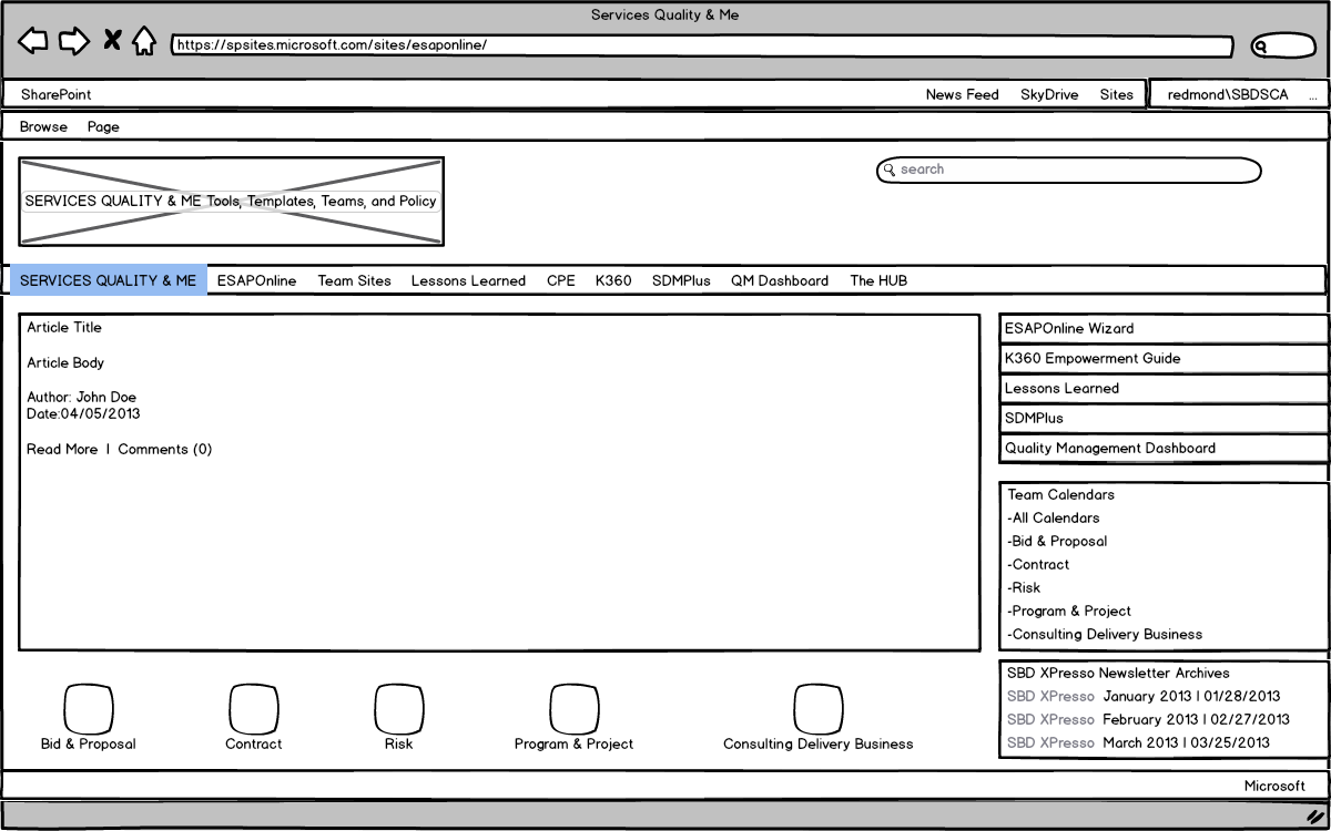
With all of that in mind I started out with a goal to simplify the navigation to the main areas visitors ventured to. For this I decided on a right hand column to be used as a secondary navigation while also serving up key information/links to calendars and resources. This left 2/3 of the page to be used as main content. Working within the brand guidelines and the constraints of SharePoint Online I got to work designing.
Keeping it clean.
The key to staying withing guidelines while working with some features SharePoint does very well was keeping the design clear of clutter.
Services Quality & Me
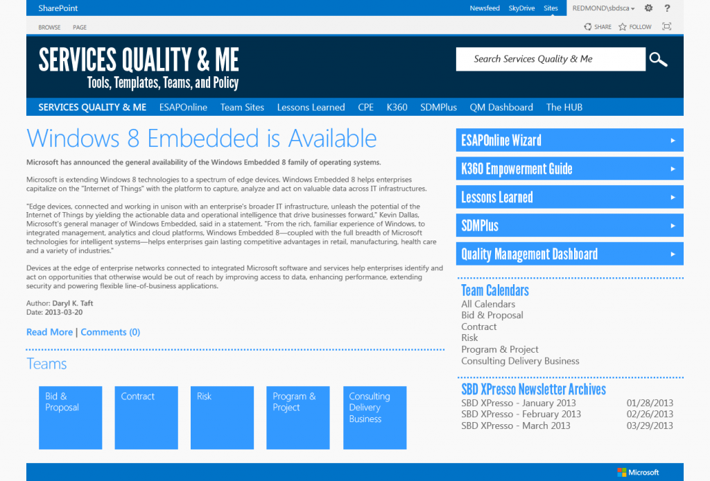
The landing page sets the stage for the rest of the site. Large real estate for content on the left, and a simple structure on the right. The right-hand column always starts with sub-navigation, flowing into content related to the current page.
Team Calendars
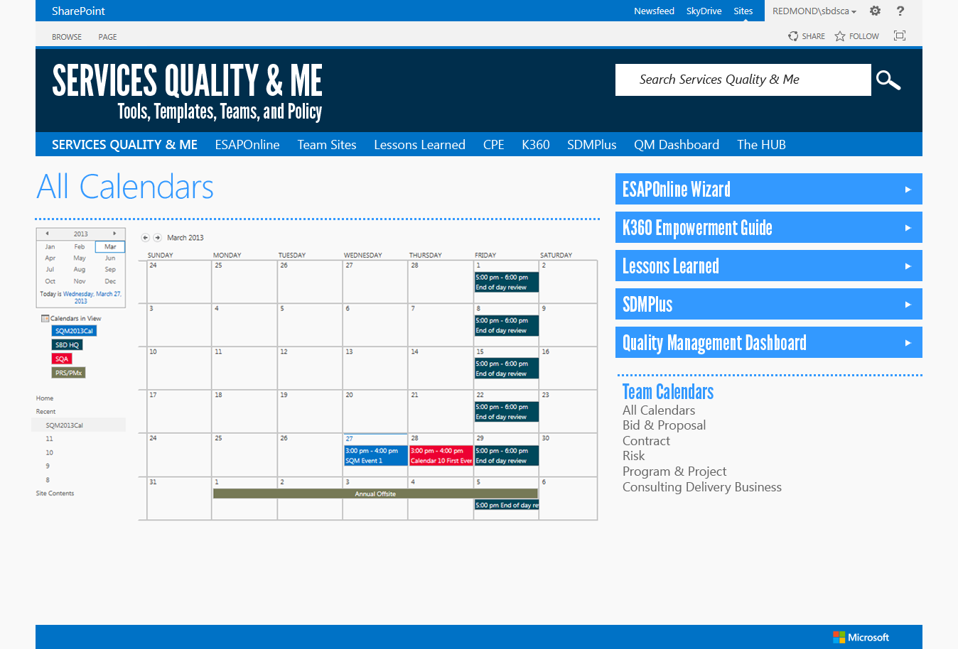
Here I leverage the out of box calendar webpart (webparts make up most SharePoint web pages). Using this feature lets the teams keep calendars that are visible online and can easily be synced with their Outlook Calendars as well.
Team Sites
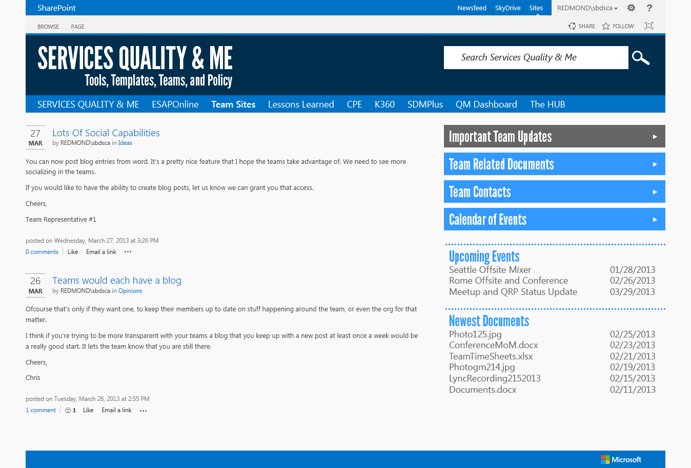
The events below leverage SharePoint 2013’s new Blog Site Template with some tweaks to make them more visually appealing.
On a roll
Once the first few pages were complete the rest of the design started to fall into place.
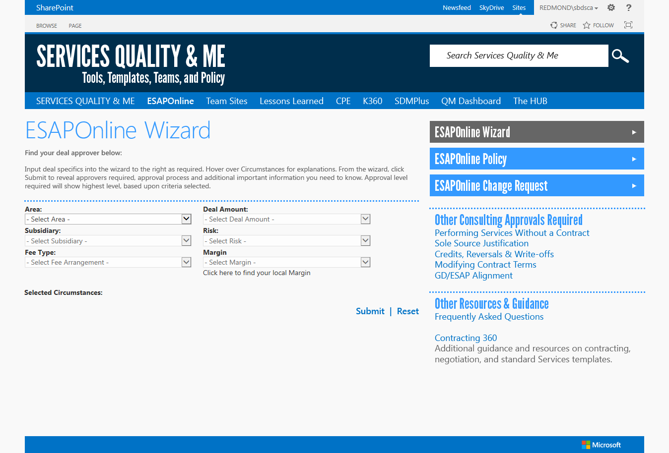
ESAPOnline Wizard
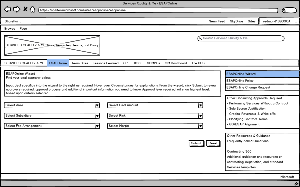
This is a fairly heavily used form. The key here was to format the form in a way that was intuitive but didn’t use up too much vertical real estate. I wanted to make sure the results could be seen below the form on submit.
The HUB
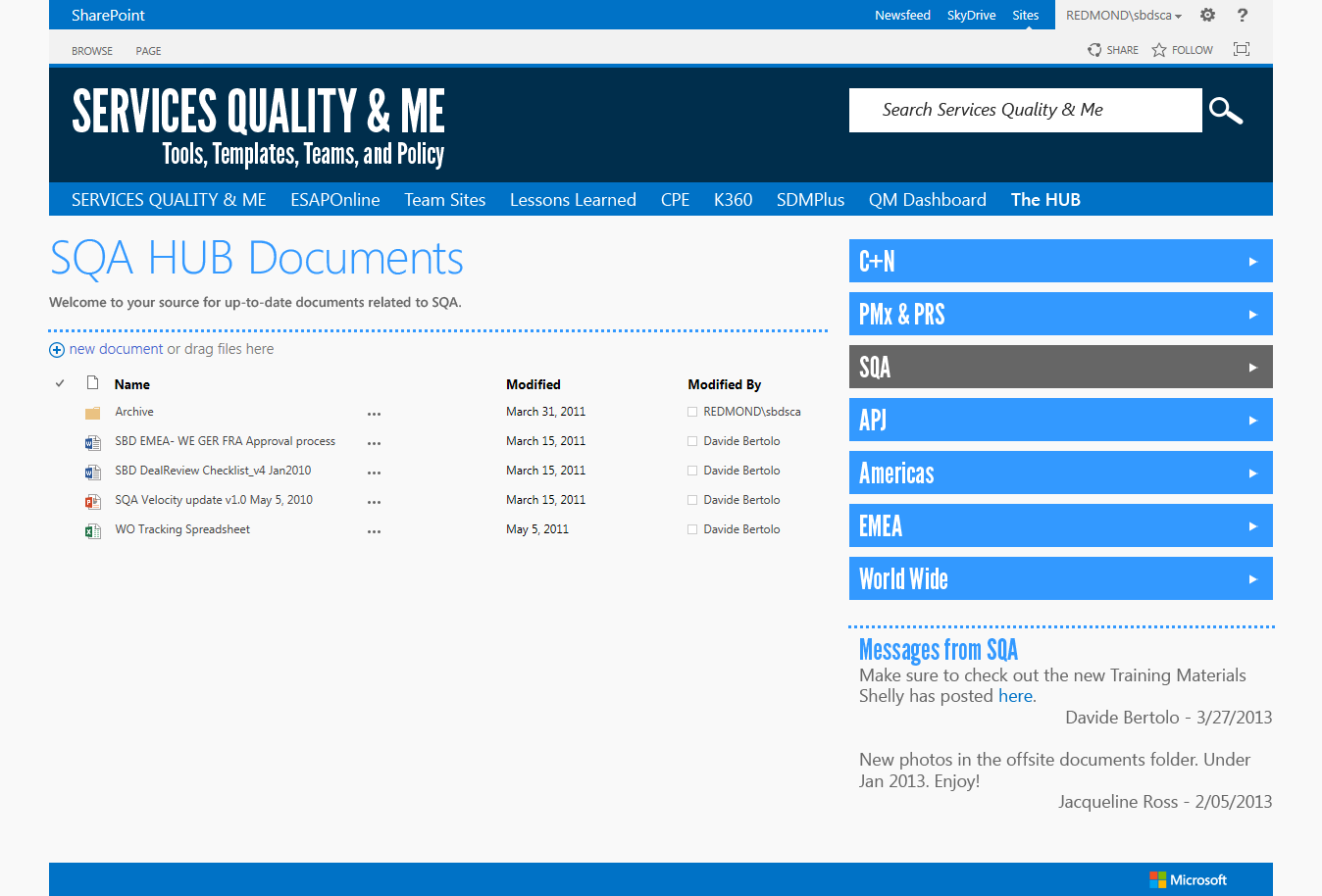
The HUB is a repository of all the knowledge across all of the regions of the world (according to the Services Business Desk). The navigation was key here as it dives users into all the documents and templates they may need to find for day to day tasks.
Wireframes
The best web designs start with solid plans.
