Developer Business Operations
Internal Marketing Site
The Challenge
At the onset of this project I was provided with a video that was to be the center of the site. It was the driving factor for this team being created and what drove them. The DBP team was undertaking the extremely difficult task of convincing multiple Microsoft teams to work together to create a single experience and workflow for Developers trying to get their apps in the various MS Marketplaces. The site was to be an internal Marketing tool to let the Marketplace teams explore the benefit and relative ease of switching over.
The Solution
After the new logo was designed it was time for me to step to the plate and put together the look and feel of the site this team would use an refer to on a daily basis. I started with very in depth wireframes followed by mockups that showed functionality as well. Once the design was decided upon and approved by the client, I created red lines for the developer who would be taking the project to the finish line.
Wireframing
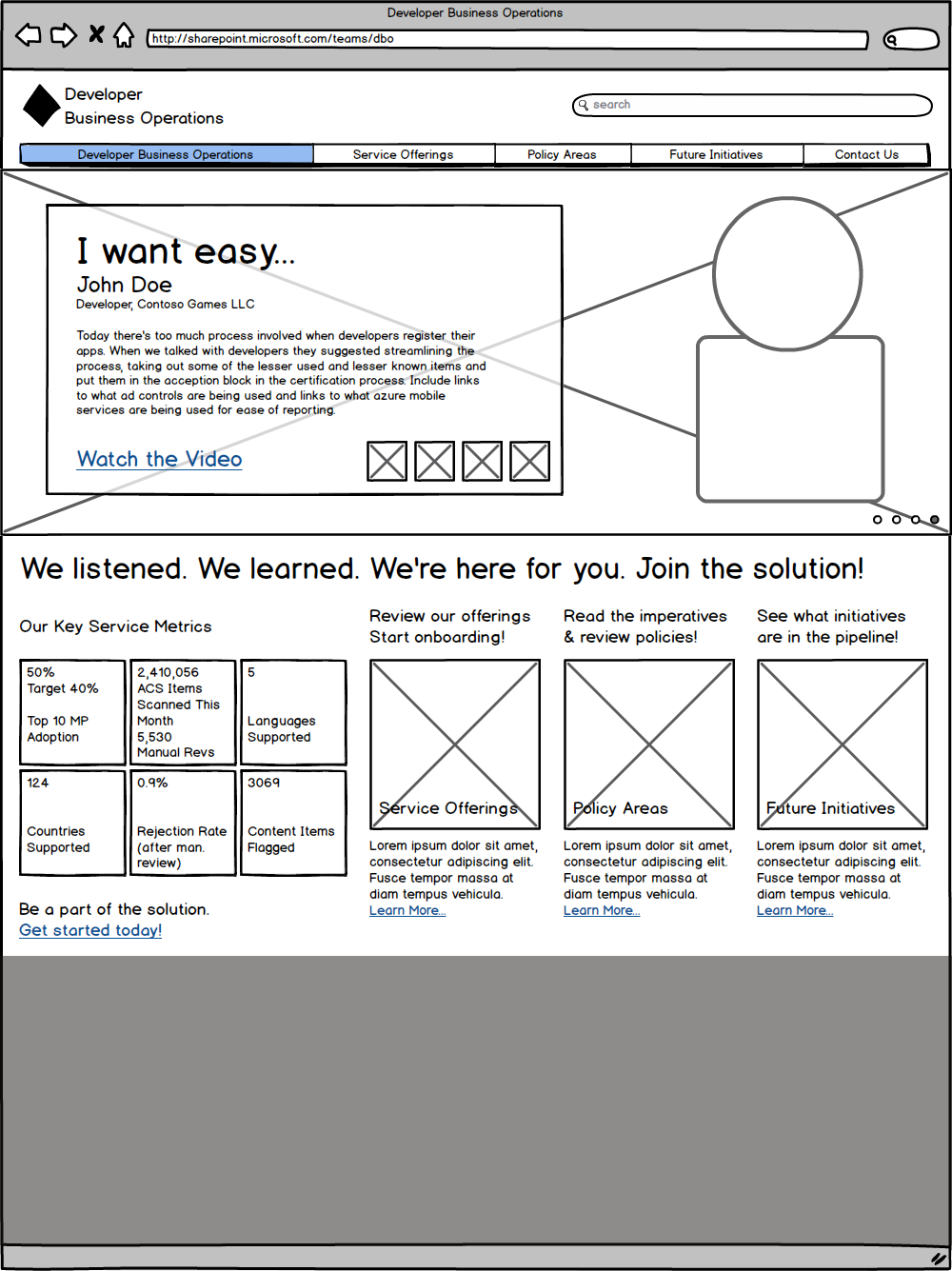
Wireframes are the bones, they set the underlying structure that good design is built upon.
The Wireframe
I went through a decent number of wireframes on this project. At the onset of the project the client had passed along some roughly developed wireframes in Visio. After one round of changes using Visio and seeing that we would be going into a second, if not more rounds I decided to speed up my wireframing by using Balsamiq. With its wealth of out-of-the-box features Balsamiq allowed for much faster, fluid wireframing.
Make it easier…
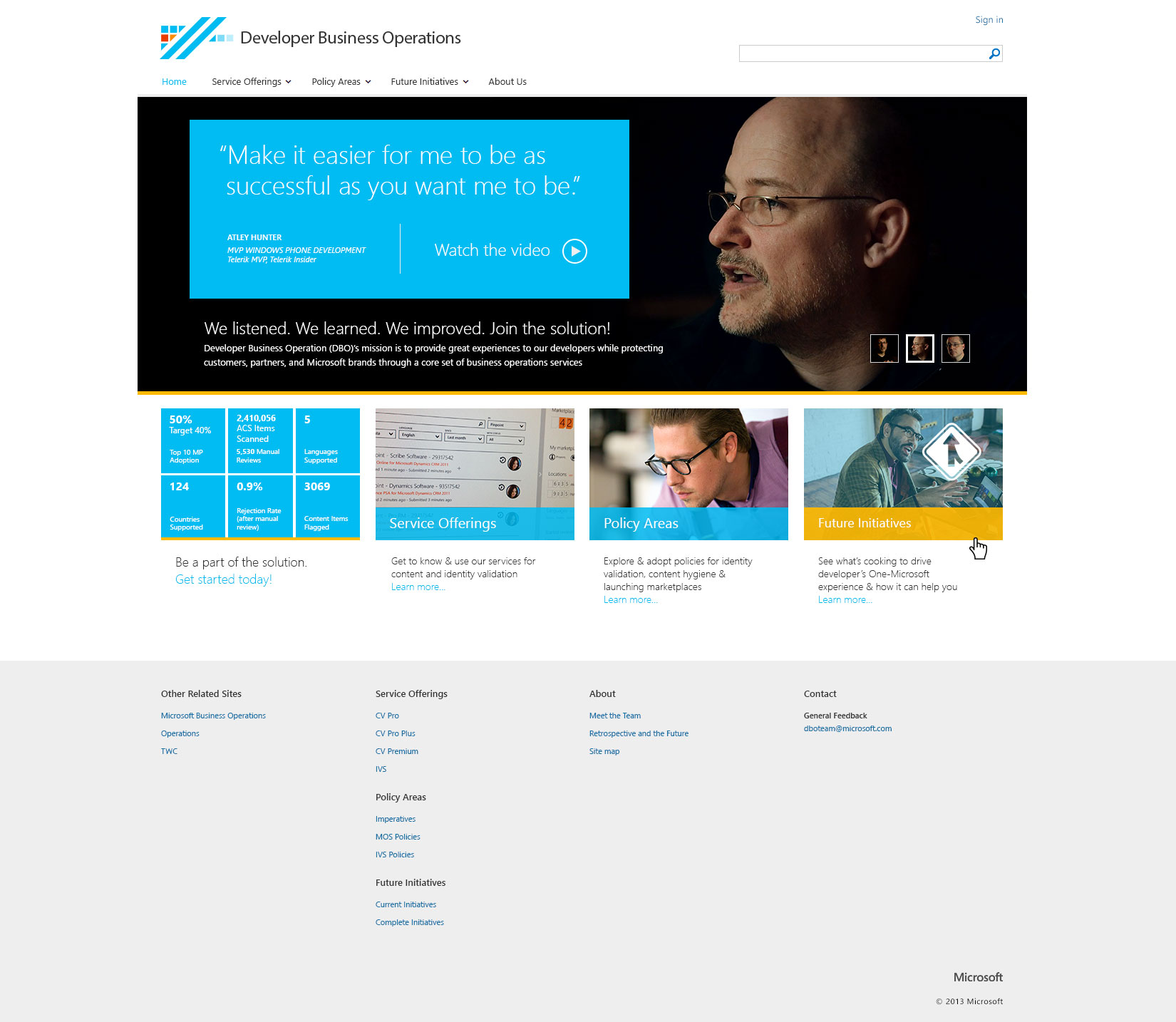
The developers had one very clear ask. Make it easier. This idea rang through my head as I was designing the Experience, and the look & feel.
The video
The landing page was to focus on the video and the actual developers whose words were the foundation that the team was using to effect change. I designed a hero carousel that rotates through compelling thoughts from the various developers and incorporated a link on each to open the video in a modal window.
Service Offerings
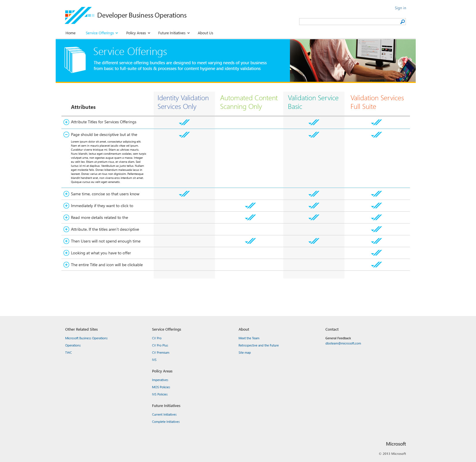
The Developer Business Portal team wanted to give the Marketplaces a few options for levels of service. They knew that not all marketplaces are created equal, some have more money to spend internally, and some have less. Knowing the teams should be able to easily scan and decide on their level, I designed a comparison page to provide a simple side by side view of the various offerings. In an attempt to bring some interest to the page besides the text, I chose to incorporate the a double line in the check marks reminiscent of the logo.
A secondary necessity
Marketing was the primary goal of the site, but it wasn’t the only one. A secondary use of the site was the day to day use by the Developer Business Portal Validation Team. On a daily basis it is their job to go through apps submitted and make sure that they meet criteria and don’t break any of Microsoft’s marketplace rules.
Policy Areas
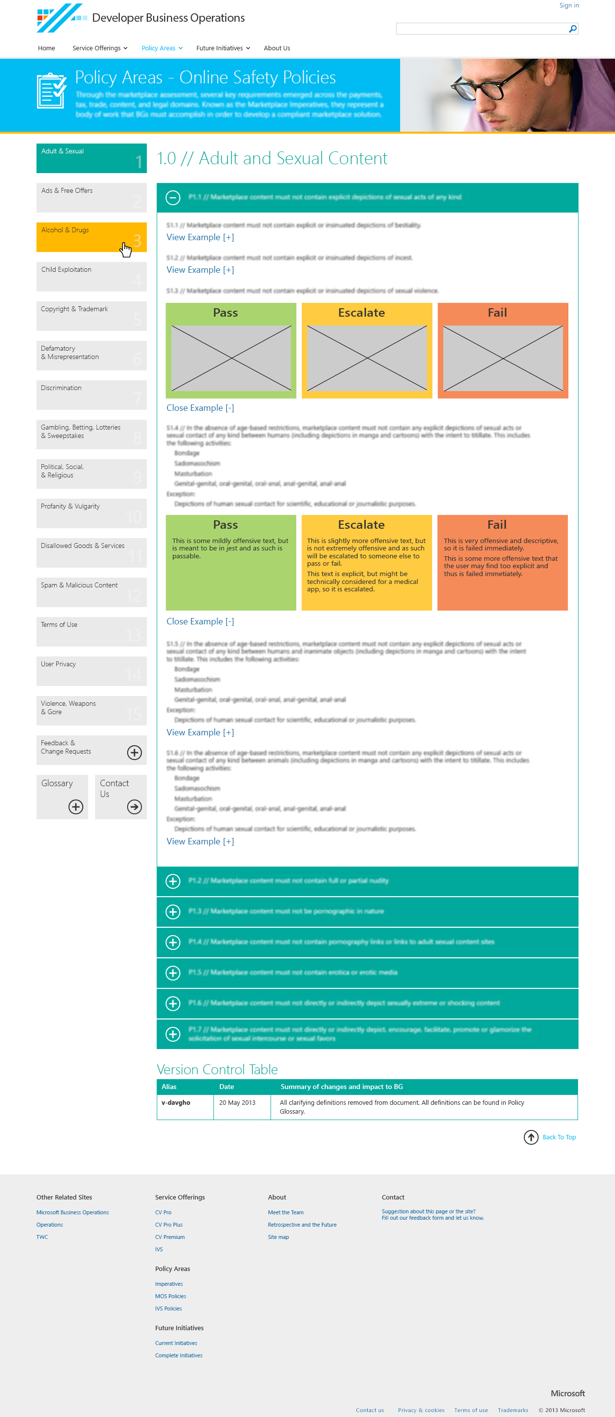
Keeping with the look and feel of the rest of the site, the Policy Areas portion was a large database that needed to be easily scanned by policy enforcers on a daily basis. I designed this in the form of a waterfall. On the left the user selects a Policy category that the product might break. Then they delve deeper into that category to specific policies, with image/text examples as needed to confirm if the app does or does not break the policies set forth.
Redlines
If wireframes set the stage for great design, redlines do the same for development.
The Redlines
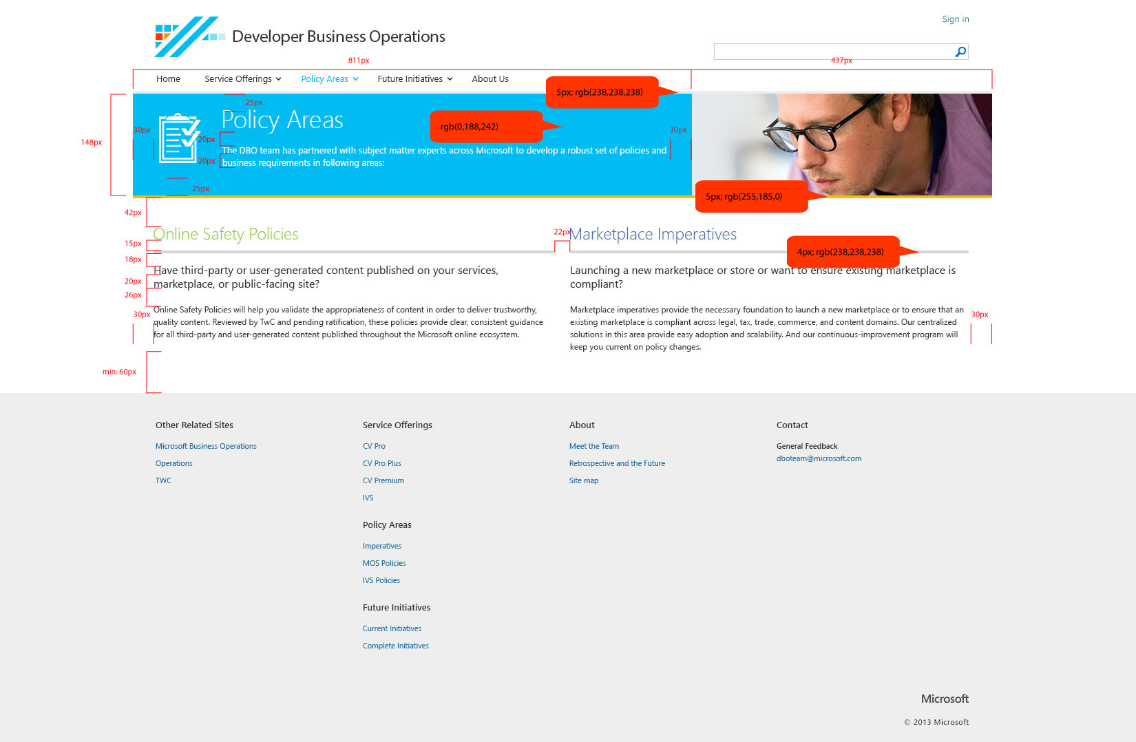
At the end of my initial portion of the project I created two sets of redlines and produced all the assets the developer should need to create the pages. I like creating two sets of redlines (one for fonts, and one for sizing/padding/margins/borders) so that they don’t get cluttered to the point of illegibility.
A hiccup.
Development was moving along nicely until it became apparent that the deadline wasn’t going to be met after an additional page was put on the table. Since the main developer was on the hook for the bulk of the site, I was given the go ahead to develop the About Us page, after designing it of course. And just like that, we managed to make the deadline and produce a really well though out and detailed website.
