Minoton
Rock ‘n Roll Branding
The Challenge
This project was to create a logo and eventually album cover for the band Minoton. The band is a Psychedelic Acid Rock with an overarching theme of Dungeons & Dragons-esque humor. I needed to be able to tie in the band’s musical style with their name’s origin.
The Solution
The band’s name is that of a great golden statue of the Minotaur sent to defeat Sinbad in the film Sinbad and the Eye of the Tiger. That being the origin of the name and the fact that I knew the musicians grew up in the days of bands like Iron Maiden and Metallica, I had a solid starting ground.
Not one logo, but two.
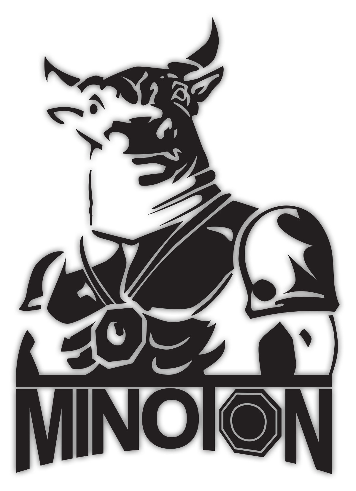
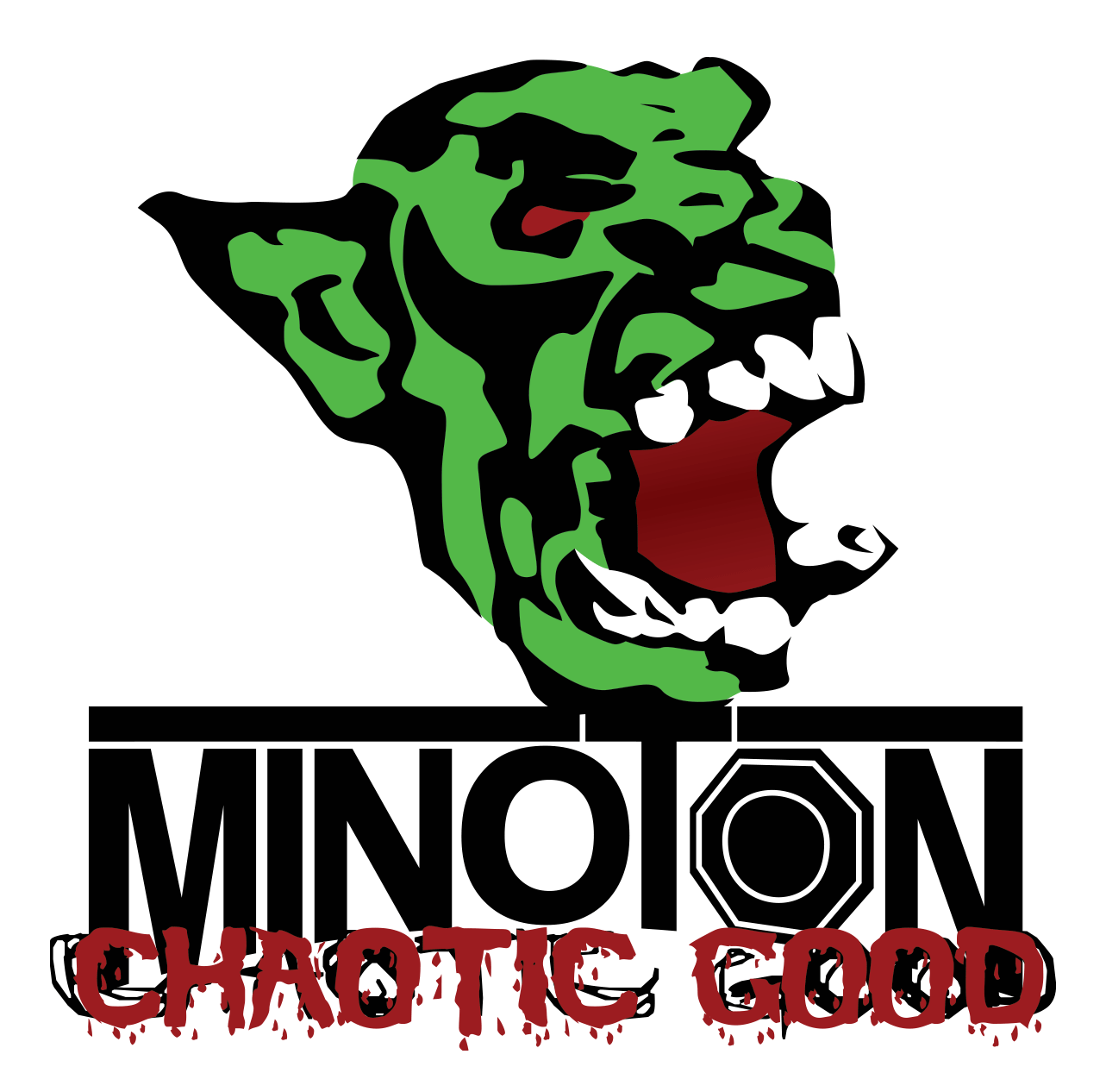
In order to get the logo to fit on multiple formats I created two. A taller version with the Minoton in all his glory towering over the textual logo, and another that just incorporates the text.

Minoton Typography
As I got to creating the logo, I first went through a round of font choices. I never found one that worked 100%, so I just started messing around in Illustrator tracing and retracing a hand drawn version I had done in a sketchbook. I knew I wanted to incorporate the Minotaur’s golden locket (which covered his heart in the film and was key to destroying the beast) I just wasn’t sure where. When all was said and done the locket made the most sense off to the right, so that if it were stacked with the Minotaur it wouldn’t be too repetitive. The curved text was a nod to Metallica.
Iconography
Once I had the text down it was time to create the mighty beast himself, or at least his likeness. I used tracing paper to get a rough outline of his highlights. I used these to create a negative in illustrator so that anywhere he would be in shadow blends into the background and the highlights are the solid color. It created a great stencil like figure that truly compliments the band’s style.

The CDs
The logo has seen t-shirts, beer koozies, even hot sauce labels for the band’s first album release. They came back to me when it was time to release their album titled, Chaotic Good.

What is Chaotic Good?
In D&D there is an Alignment System. It’s basically a 3×3 matrix. Across one axis you have Good, Neutral, and Evil. Across the other you have Lawful, Neutral, and Chaotic. Wikipedia defines them as such: Chaotic good characters usually intend to do the right thing, but their methods are generally disorganized and often out of sync with the rest of society. With this in mind we decided to go with a Goblin (even though they are traditionally Neutral Evil). The thought here was that maybe Goblins are trying to do good, but their idea of good is a bit skewed.
